The Story Behind The Software Machine: A Minimalist Identity for a Complete Tech Provider
In the ever-evolving world of technology, a brand identity must reflect not just the services it offers but also the philosophy it stands for. The Software Machine embarked on a journey to create a logo and visual identity that encapsulates its role as a complete umbrella for technology solutions while maintaining simplicity and sophistication.
The Vision: Technology Under One Roof
From the beginning, The Software Machine aimed to position itself as a one-stop solution for technological services. The challenge was to visually represent this vision—bringing together the vastness of technology in a unified, minimalist form. The team sought to design a brand language that reflected innovation, integration, and scalability while remaining approachable and timeless.
Learning from the Giants
Inspiration played a key role in this creative journey. Taking cues from industry giants, the team studied the theory of design used by the leaders in technology—how simplicity often communicates the most powerful message. These insights highlighted the importance of clean shapes, negative space, and subtle visual cues that tell a bigger story. This understanding fueled the creative process and set the tone for the design exploration.
Sketching the Concept
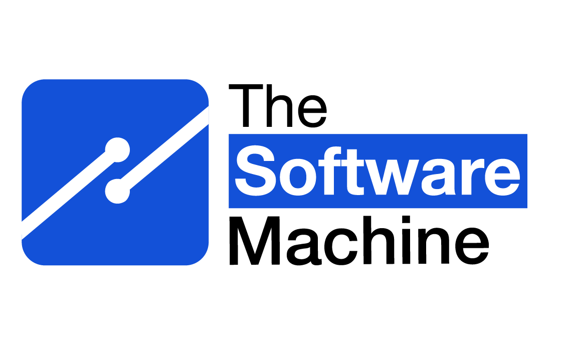
The journey from vision to reality wasn’t straightforward. The team worked through countless sketches and iterations, experimenting with shapes, lines, alphabets, and even numerical to find a balance between abstraction and meaning. A critical breakthrough emerged in the form of the indirect representation of the letter ‘S’ within the logo design.
The diagonal line cutting across the square, flanked by two dots, carries layers of meaning. It subtly nods to the ‘S’ in Software Machine while also representing:
- Connectivity: The dots symbolize nodes in a network, emphasizing the brand’s ability to bring everything together seamlessly.
- Progression: The upward diagonal reflects growth, innovation, and the future-focused nature of the brand.
- Holistic Tech Solutions: The square acts as an encompassing frame, representing the comprehensive nature of services offered under one roof.
